Designing a simpler mobile shopping experience.
Family Garden already had an e-commerce website. I designed a mobile shopping experience that worked with the existing ecosystem by first understanding its API, data structure and business flows.
- Role
- UX/UI Designer
- Platform
- Mobile App
- Type
- E-commerce
- Focus
- UX Strategy • UI Design • Design System
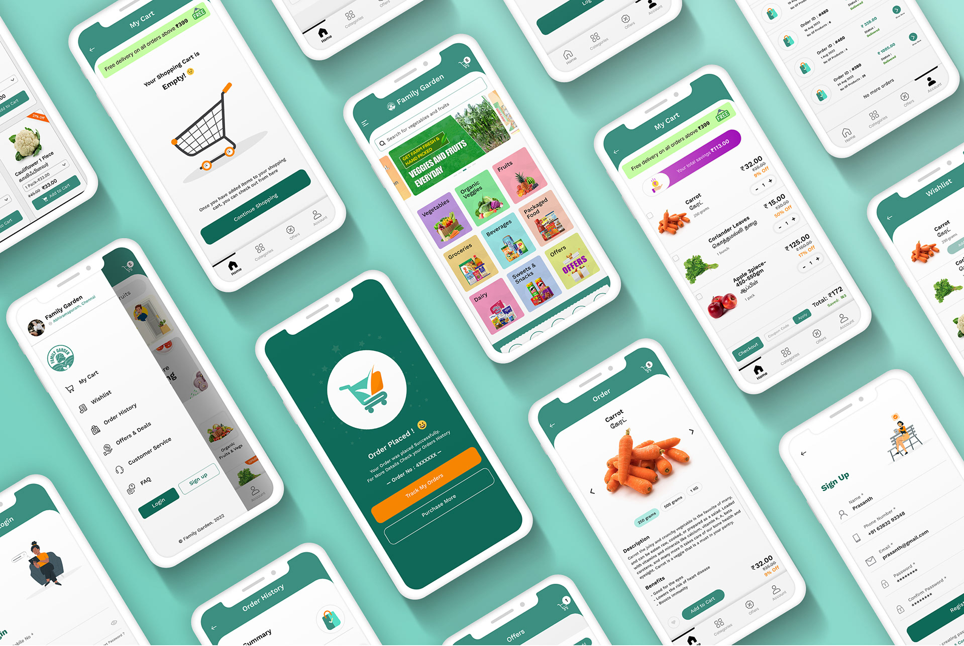
From an existing website to a mobile experience
Family Garden already had an established e-commerce website. The goal was to extend the shopping experience to mobile while continuing to use the existing backend and APIs.
Rather than designing the mobile app in isolation, I first understood the existing system and designed the experience around what the platform could support.
The challenge was more than designing screens
01
Existing ecosystem
The mobile app needed to work with the existing e-commerce website and backend.
02
API-driven experience
I needed to understand the available API data and functionality before defining the mobile experience.
03
Simple mobile journey
The existing business functionality needed to translate into a simple, intuitive mobile shopping flow.
“How might we create a simple mobile shopping experience without disrupting the existing e-commerce ecosystem?”
Understand first. Design second.
Before starting the UI design, I reviewed the existing e-commerce experience and worked through the available API structure to understand what data and functionality could be used in the mobile application.
Mapping the API to the user experience
Product data
Category data
Cart data
Customer data
Order data
Checkout / payment
The API understanding helped define what the mobile experience could realistically support.
Design within technical reality
Instead of designing an ideal mobile experience first and checking feasibility later, I considered the existing API and business logic while defining the user journey.
↓ Mobile UX
The goal was to find the right balance between user experience and technical feasibility.
Designing around the shopping journey
I structured the experience around the complete shopping journey rather than designing individual screens independently.
“Every screen should have a clear purpose and a clear next action.”
Key UX challenges
Challenge 01
Users need to find products quickly.
Designed a visually scannable home and category experience.
- Product cards
- Category navigation
- Clear hierarchy
- Consistent imagery
- Simple navigation
Result: users can move quickly from discovery to relevant products.
Challenge 02
Users need enough information to make a purchase decision.
Designed a focused product experience with:
- Product image
- Product information
- Price
- Quantity
- Add to cart
“Give users the right information at the right moment.”
Challenge 03
Checkout can become a high-friction part of mobile shopping.
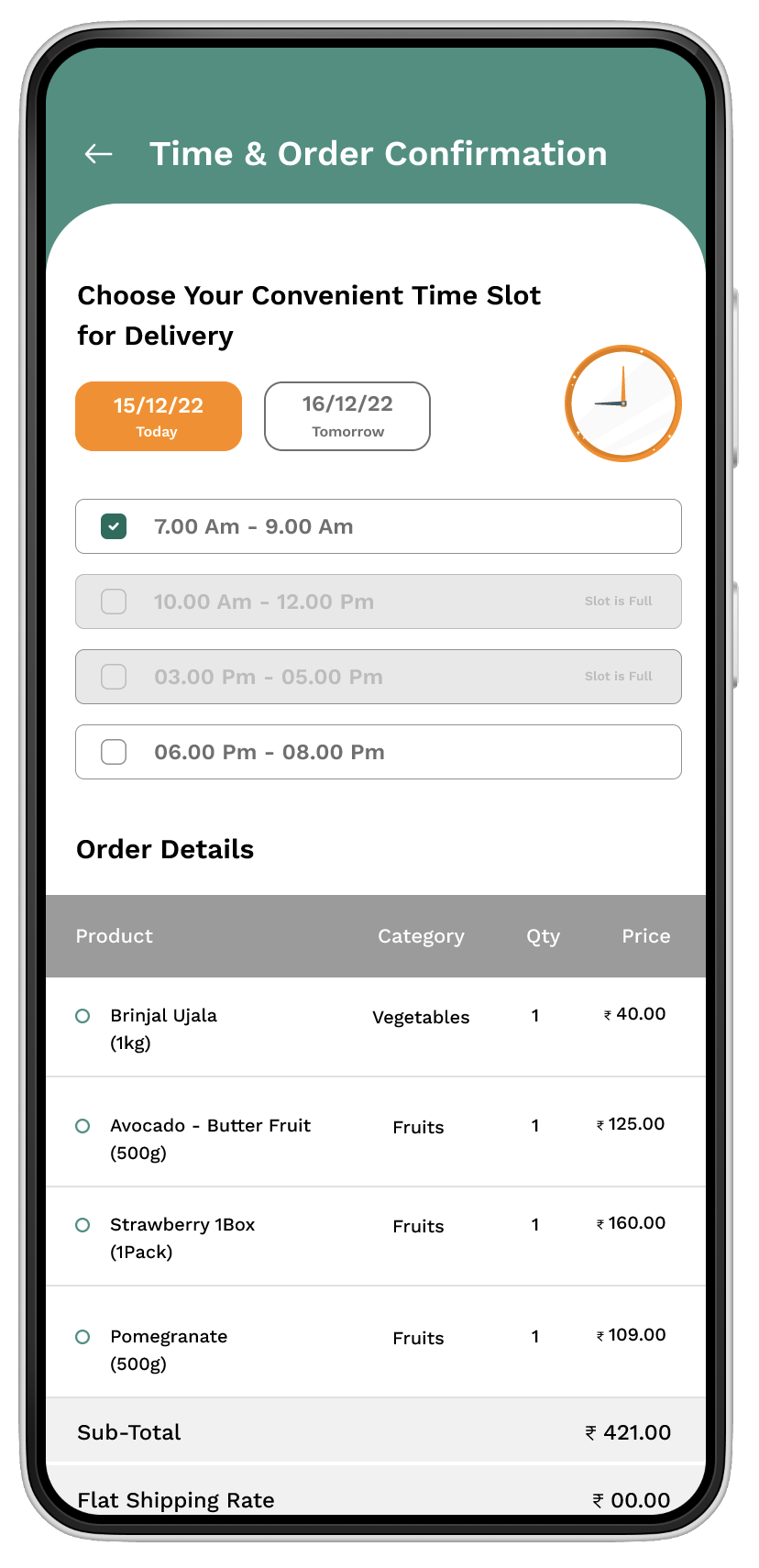
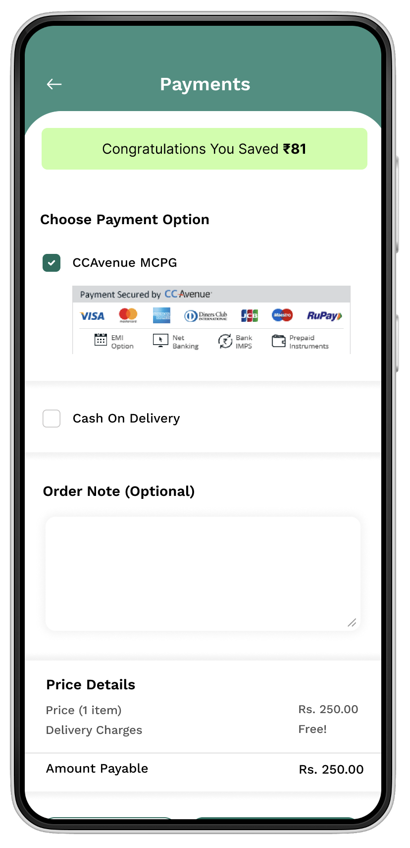
Structured the final journey:
Keep the primary action visible and reduce unnecessary complexity.
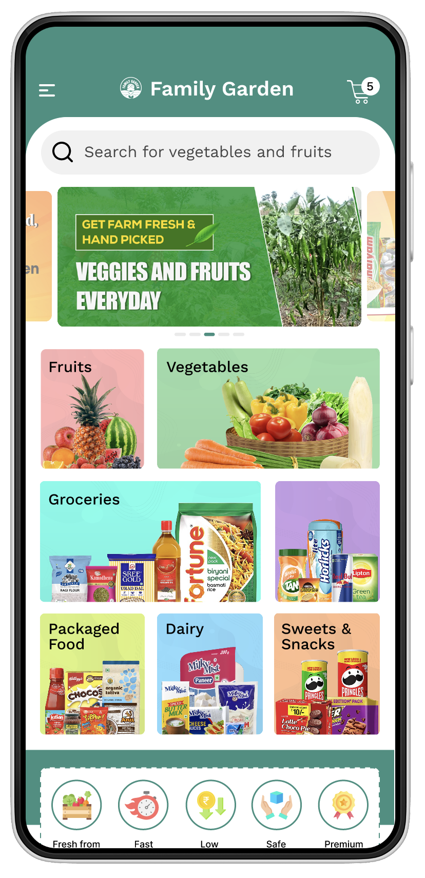
Home — Start with discovery
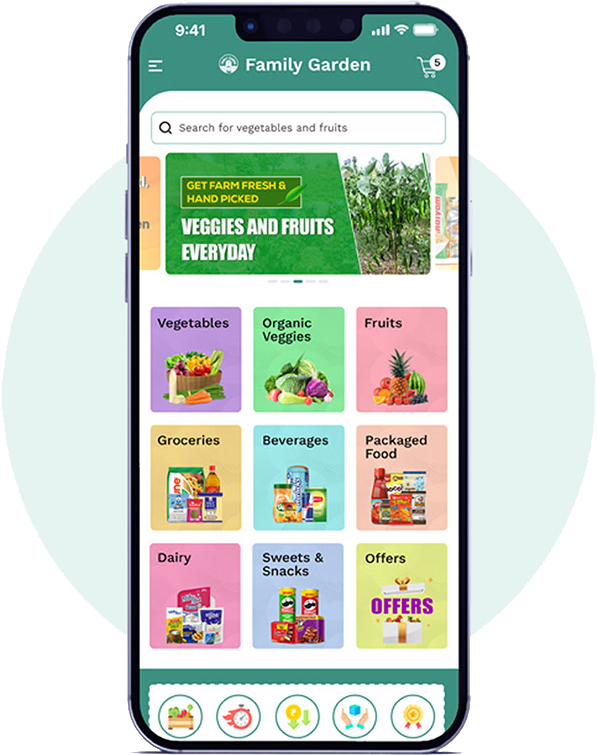
The home experience brings categories and products together so users can quickly understand what is available and start browsing.
- Product discovery
- Categories
- Visual hierarchy
- Primary navigation
- Clear actions
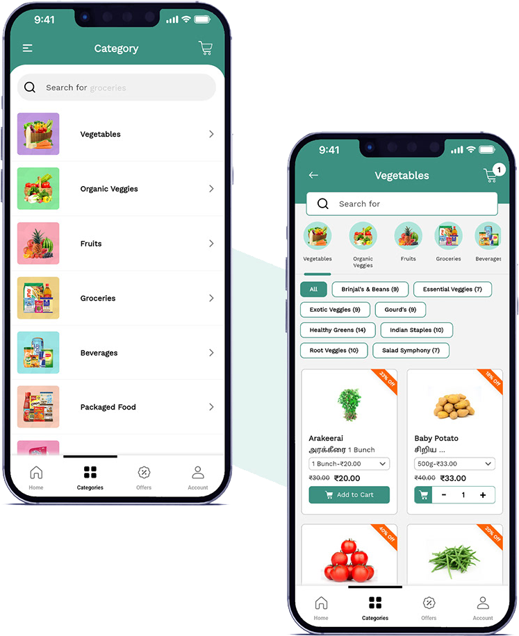
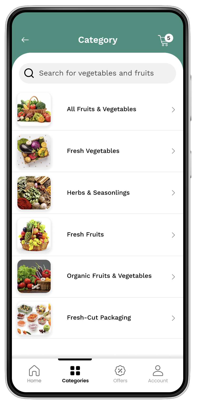
Categories — Reduce the search effort
Categories help users narrow the product space and move from general browsing to relevant products.
- Grouping
- Product cards
- Consistency
- Navigation
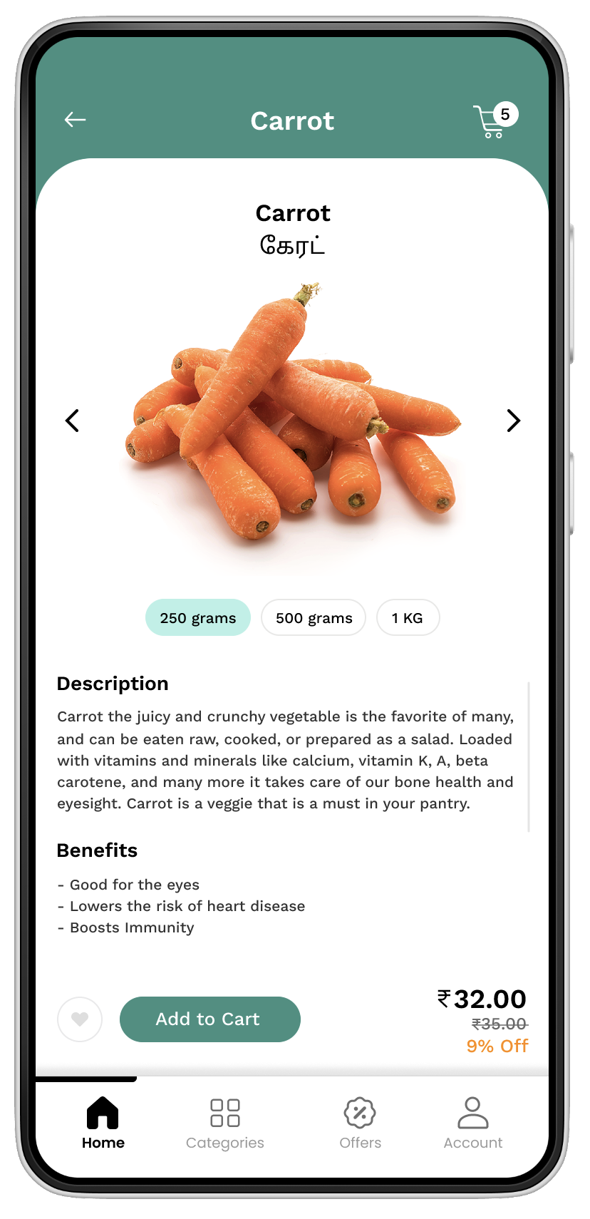
Product — Support confident decisions
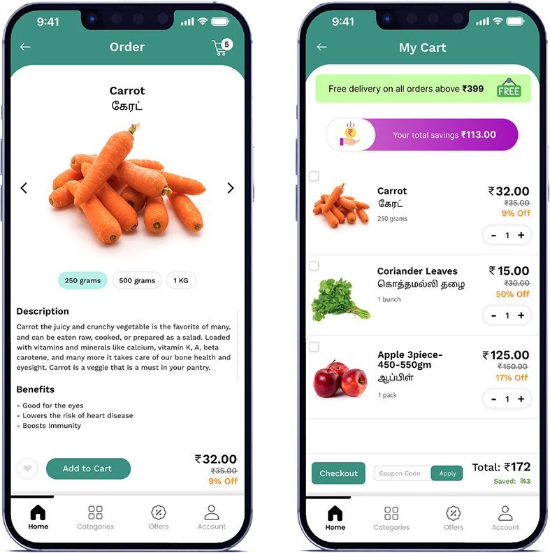
The product experience focuses on the information users need before adding an item to the cart.
- Product image
- Product information
- Price
- Quantity
- Add to cart
“Clarity before commitment.”
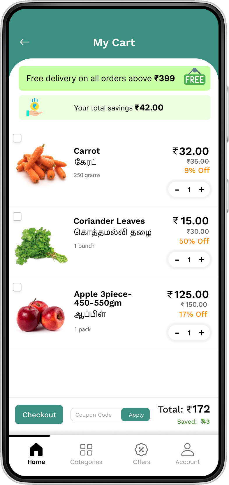
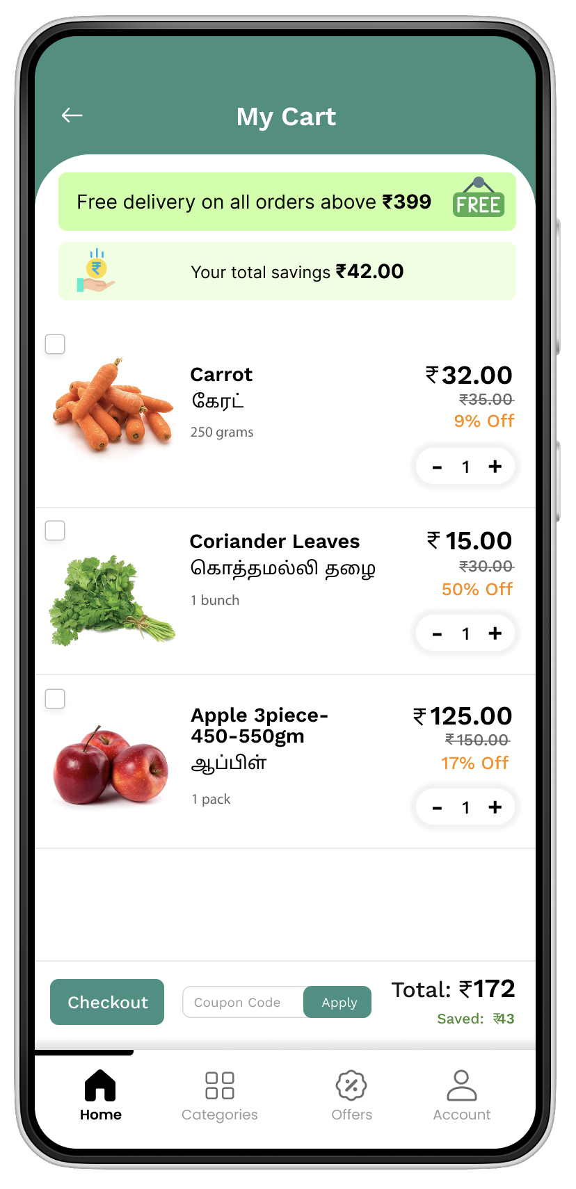
Cart — Keep the decision visible
The cart provides a clear summary of selected products before users continue to checkout.
“Make the next step obvious.”
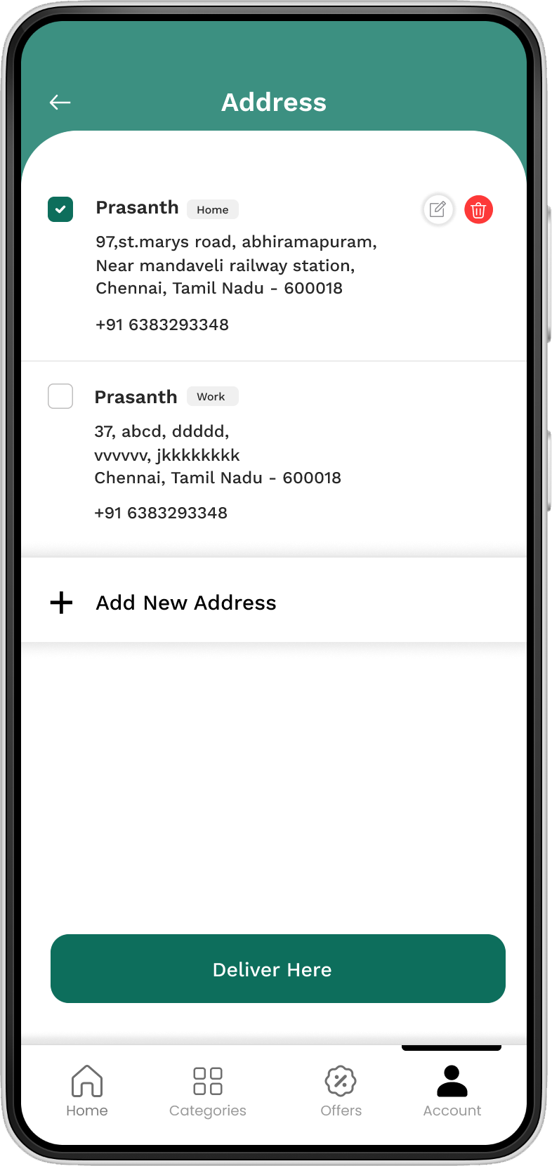
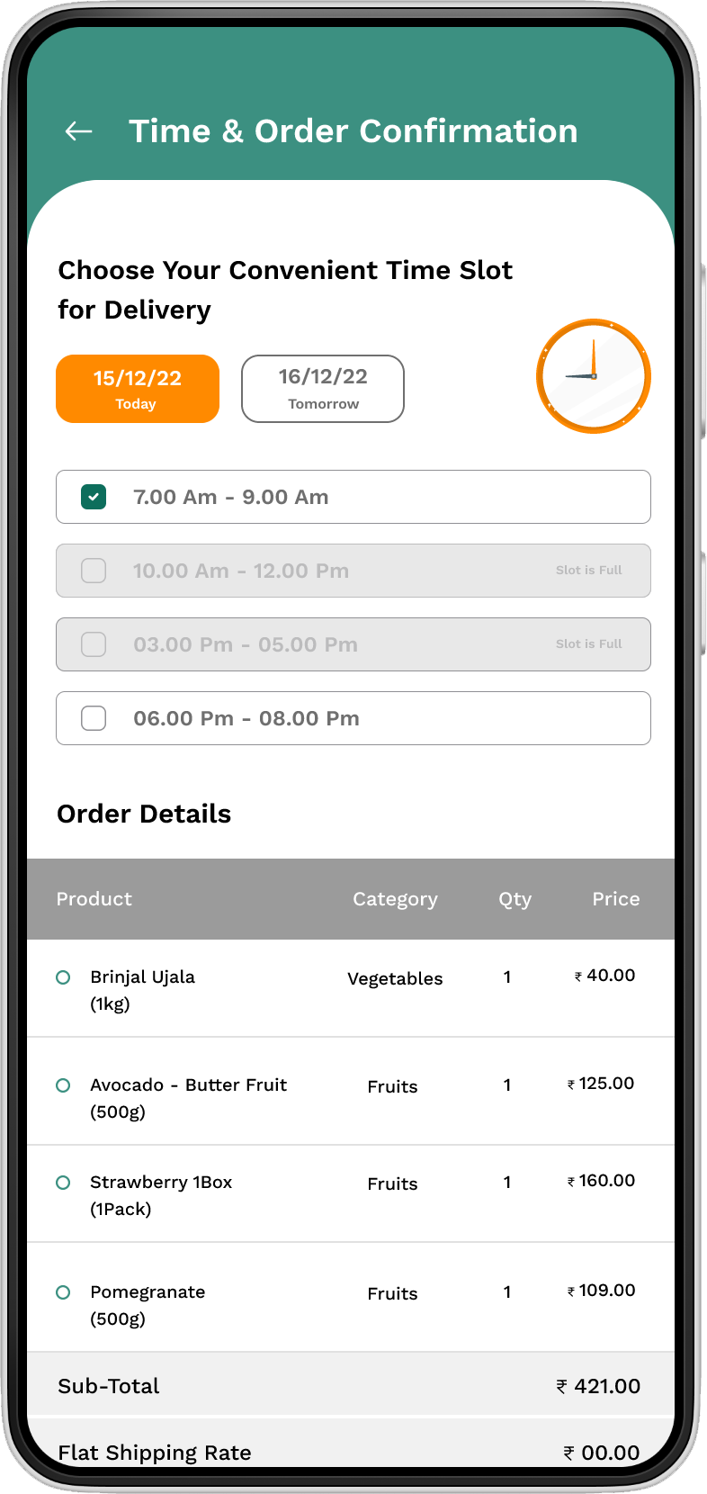
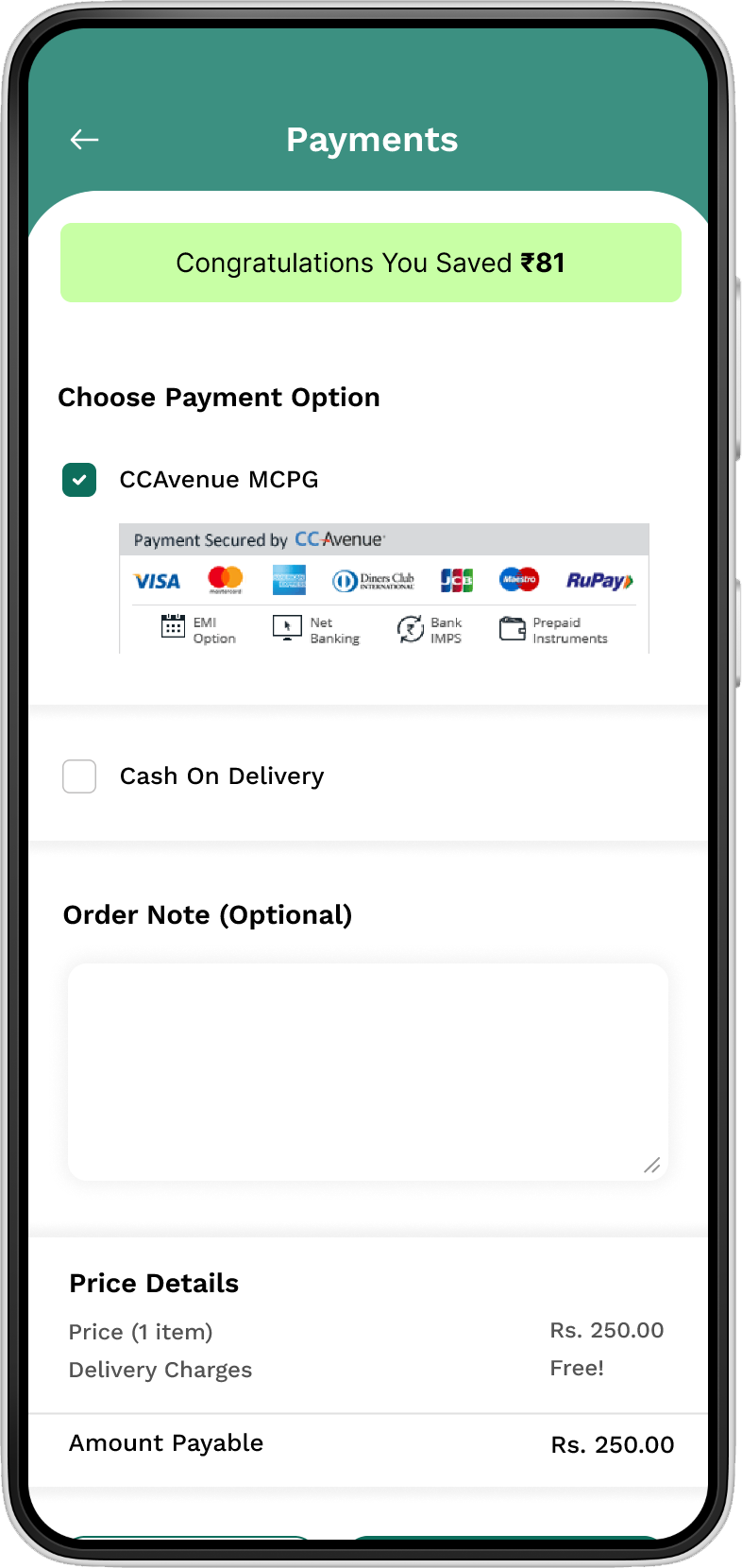
Checkout — Keep the final step simple
The final stage was designed as a focused continuation of the shopping experience rather than a separate complicated workflow.
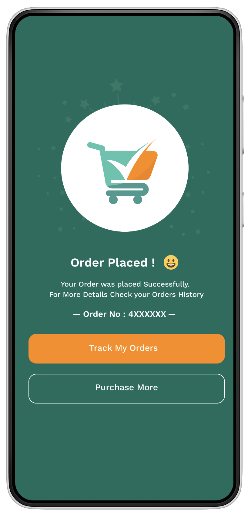
Confirmation — Close the loop
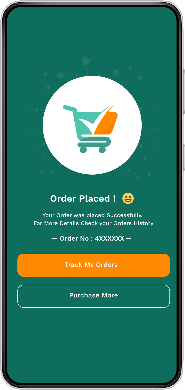
After payment, clear confirmation gives users immediate feedback that their order has been successfully completed.
“Every important action needs a clear response.”
One connected shopping experience
I designed the experience as one continuous journey — from discovering a product to completing an order.
A visual system built for consistency
Primary
Brand identity and primary actions.
Secondary
Emphasis, CTAs and attention moments.
Black
Typography and important information.
Dark grey
Secondary text and supporting content.
Mid grey
Subtle text, icons and disabled states.
Light grey
Backgrounds, borders and dividers.
White
Cards, surfaces and clean space.
Typography
Work Sans
Bold — 24px – 48px+
Semi Bold — 20px – 32px
Medium — 16px – 20px
Regular — 14px – 18px
Work Sans creates a clean, friendly and readable hierarchy across the shopping experience.
Navigation
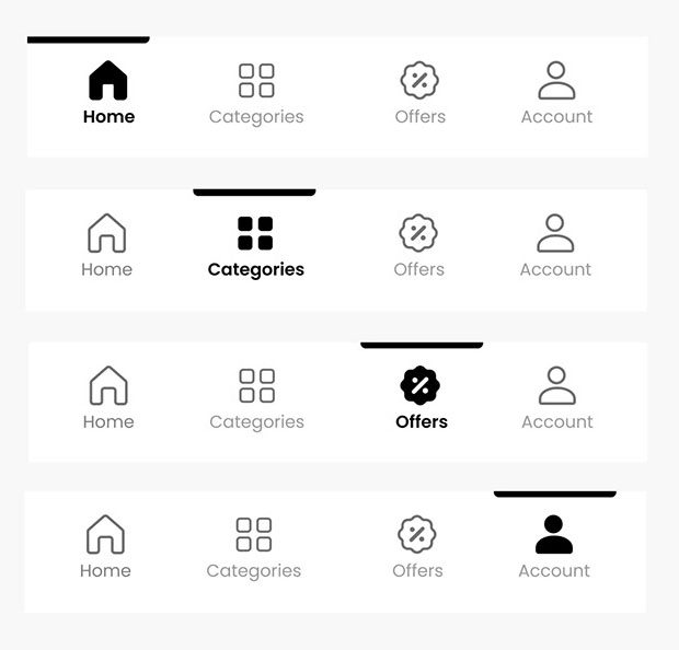
A simple four-item tab bar keeps the core journeys within one tap, with clear active-state feedback.
Components
- Navigation
- Product cards
- Category cards
- Buttons
- Inputs
- Cart components
- Order components
- Status elements
Reusable components keep the experience consistent across the complete shopping journey.
Consistency supports the experience
The design system was not created only for visual consistency. It helped create predictable interactions throughout the shopping journey.
Simple by design
01
Clear
Information should be easy to scan and understand.
02
Consistent
Patterns should behave consistently throughout the experience.
03
Action-focused
Every screen should guide users toward the next meaningful action.
My role
- Existing website / API understanding
- Requirement mapping
- User journey
- Information architecture
- UX flow
- Wireframes
- UI design
- Design system
- Prototyping
- Mobile experience
I translated the existing e-commerce ecosystem into a structured mobile experience, balancing user needs with existing API capabilities and business logic.
The outcome
01
Mobile experience
Created a structured mobile shopping journey.
02
Ecosystem alignment
Designed the app around the existing e-commerce backend and API capabilities.
03
Consistent experience
Established a reusable visual and interaction system.
04
End-to-end flow
Connected discovery, product selection, cart, checkout and confirmation into one journey.
What this project taught me
UX doesn't always start with a blank canvas.
Understanding existing systems and technical constraints can improve the product experience.
API capabilities can influence UX decisions, so understanding the underlying system early helps avoid unrealistic designs.
A strong mobile experience should feel simple to the user, even when the system behind it is complex.
Designing beyond the screen.
The project taught me to look beyond UI — understanding the existing ecosystem, mapping technical capabilities and then designing an experience that works for both users and the product.
From an existing e-commerce platform to a focused mobile shopping experience.
Next Project
MedQuick →