Projects
Projects

Luxury Island Bahamas

Transforming an outdated brochure into a premium, conversion-focused island experience.

Role
Lead UX/UI Designer
Platform
WordPress + Elementor
Year
2024
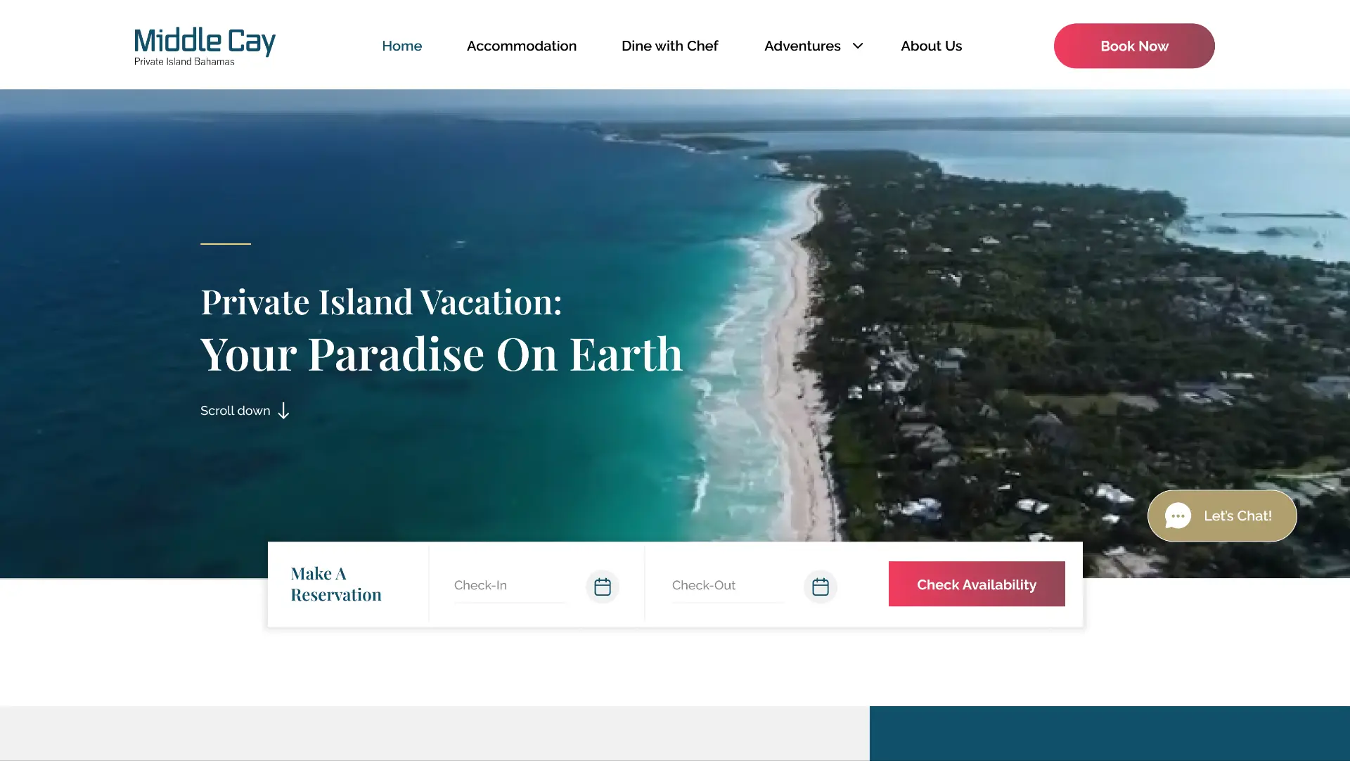
Middle Cay redesigned website homepage hero with reservation bar
01 · Context

The Destination

Middle Cay is a private island in the Bahamas — total seclusion, pristine water, world-class hospitality. The owner had invested everything into building something extraordinary.

But the website didn't show any of it. A single page. No photos. No booking system. No clear navigation. Just text — on a destination that sells itself through experience.

"A world-class destination. An invisible digital presence."
01 · Context continued

Two Sides. Same Problem.

The Owner

She had poured everything into the island. But enquiries were low and revenue wasn't matching the investment. The website was turning guests away before they ever felt the magic.

The Guest

Travellers ready to spend on a once-in-a-lifetime experience landed on the site and couldn't find answers to the simplest questions — What does it look like? How do I book? So they left. And booked somewhere else.

She needed a website that worked as hard as she did.

02 · Problem

A Luxury Experience Hidden Behind an Outdated Website

The island competed with resorts spending heavily on digital storytelling — yet its only asset online was a page of unformatted text. Every enquiry arrived by email, every question was answered manually, and most travellers never got that far.

1 page

Entire site was a single scroll

0 CTAs

No booking or enquiry path

0 SEO

No blog, FAQ or meta structure

$14K+

Value of each missed booking

HMW 01 —

How might we let guests feel the island within seconds of landing?

HMW 02 —

How might we make booking obvious, trusted and three clicks away?

HMW 03 —

How might we structure content so search engines can find the island?

HMW 04 —

How might we answer every pre-booking question before it's asked?

03 · Users

Who Was Trying to Book

AR

Amelia Reyes

Milestone celebrant · 38 · New York

  • Anniversary trip
  • High intent

Goals

  • See real photography of the island
  • Confirm privacy and exclusivity

Frustrations

  • No visuals to justify the price
  • Unclear who else is on the island

Behaviours

  • Compares 4–6 destinations
  • Saves inspiration to a shared board

Triggers

  • Availability calendar
  • Concierge response within a day
"If I can't picture us there, I'm not spending forty thousand dollars on it."
  • Group of 6
  • 3 weeks research
  • $42K booking
DK

Daniel Krause

Corporate retreat planner · 45 · London

  • Executive retreat
  • Repeat buyer

Goals

  • Capacity, logistics and transfers in one place
  • A proposal-ready page to share

Frustrations

  • Had to email for basic facts
  • No downloadable details

Behaviours

  • Shortlists in a spreadsheet
  • Needs sign-off from three people

Triggers

  • Clear rates page
  • Named point of contact
"I need answers I can forward to a CFO, not a paragraph of poetry."
  • Group of 14
  • 6 weeks research
  • $68K booking
04 · Discovery

What We Found When We Looked Closer

Before

  • One long scroll, no navigation
  • Zero photography of the island
  • No rates or availability
  • No enquiry or booking flow
  • No FAQ or logistics content
  • Not indexed for any search term

After

  • Seven purposeful pages
  • Full-bleed island photography
  • Transparent rates and seasons
  • Integrated reservation portal
  • FAQ, transfers and stay guides
  • Structured metadata and blog
05 · Challenge

The Design Brief in One Line

"Transform a static brochure into a conversion-focused luxury experience that makes guests feel the island — and act on it."

  • Luxury perception gap
  • Zero conversion path
  • No organic discovery
06 · Process

How We Approached It

User Journey Map

Mapped every moment from first search to arrival. It showed how much doubt built up before anyone reached an enquiry form.

Task Flow Diagram

Reduced booking to a single decisive path. Each branch answered a question the old site had left open.

07 · Solution

Six Decisions That Changed the Experience

Six moves, each aimed at a specific reason guests were leaving without booking.

01 · IA RESTRUCTURE

One page became seven destinations

Split the story into Stay, Experiences, Rates, Journey, Gallery and Contact so each intent has a home.

  • Sitemap
  • Nav model
02 · VISUAL NARRATIVE

Photography leads, copy supports

Full-bleed imagery and slow reveals let the water do the persuading before a single claim is made.

  • Art direction
  • Motion
03 · BOOKING PATH

Three clicks to a held date

A persistent enquiry rail plus an embedded reservation portal removed the email round-trip entirely.

  • Conversion
  • Integration
04 · TRUST LAYER

Answering the quiet objections

Transfers, staffing, privacy and cancellation surfaced as content rather than hidden in replies.

  • FAQ
  • Content design
05 · MOBILE FIRST

Designed for the phone in bed

Most discovery happened on mobile, so layouts, galleries and forms were tuned for thumb reach first.

  • Responsive
  • Performance
06 · DISCOVERY

Findable for the right traveller

Keyword-led page structure, metadata and a stay journal opened an organic path that never existed.

  • SEO
  • Editorial
08 · Craft

Designing for Luxury — The Details

Colour Theory

#0E3B41
#1F7A78
#E4D8C4
#C4622D
#1A1814

Typography

Island escapeFraunces 52/500
Body copy set for slow reading.Inter 15/1.75

Design System

  • Typography hierarchy
  • Colour tokens
  • UI components
  • Spacing system
  • Responsive grid
09 · Impact

What Changed in 3 Months

4

Direct bookings generated

$56K+

Estimated revenue unlocked

1→7

Pages restructured

3 clicks

Path to booking

Booking portal

Integrated third-party reservation system — zero to live

6 nav destinations

vs. zero structured navigation before

GTM live

Analytics tracking from day one

10 · Reflection

What I'd Do Differently

I'd photograph the island before designing a single screen. We built layouts around imagery we hoped would exist, and the first shoot forced changes I could have avoided by starting with the real material.

I'd also test the booking flow with three real travellers before development. Our assumptions about which questions blocked a booking were mostly right — but the one we missed, transfers from Nassau, turned out to be the biggest hesitation of all.

And I'd instrument the site earlier. Analytics arrived at launch, so I can describe what changed after the redesign, but not with the granularity I'd want to argue for the next round of investment.

11 · Prototype

Explore the Experience

Next Project

Coming Soon →

Vigneshwaran G · 2024