UX Case Study • Mobile App
Making Biblical Learning More Accessible on Mobile
Designing a simple, culturally relevant mobile experience for Assyrian Biblical Studies — bringing live sessions, events and curated biblical content into one accessible platform.
- Role
- UX Designer
- Duration
- 2 Weeks
- Platform
- iOS & Android
- Category
- Digital Learning / Community
Role
UX Designer
Duration
2 Weeks
Platform
iOS + Android
Focus
Mobile-first content experience
The goal was to transform an existing content-heavy experience into a simple mobile platform where users could discover sessions, participate in events and access biblical study videos with minimal friction.
Context
Assyrian Biblical Studies focuses on helping Assyrian believers explore Scripture through their own linguistic and cultural context. The organization provides biblical studies, sessions, events and educational content designed to deepen understanding of Scripture.
The existing web experience contained valuable content, but accessing that content on mobile was not always seamless. The opportunity was to create a dedicated mobile experience that made important content easier to discover, access and engage with.
- Content
- Sessions
- Events
- Videos
- Community
Where the experience was falling short
Rich content was available, but the mobile experience created friction between users and the content they wanted to access.
Mobile accessibility
Users needed a simpler way to access biblical content while using mobile devices.
Missed updates
Without a dedicated place for upcoming sessions and events, users could miss important opportunities to participate.
Fragmented video experience
Users often had to move between different platforms to discover and watch biblical study videos.
“How might we create a simple mobile experience that makes biblical learning, sessions and community activities easier to discover and access?”
Design goals
Real-time engagement
Make upcoming sessions and events easy to discover and access.
Seamless video access
Bring curated biblical study videos into one accessible experience.
Simplicity
Reduce complexity and make the experience intuitive for users across different age groups.
Cultural relevance
Respect the linguistic and cultural context of the Assyrian community.
My UX approach
Step 1
Understand
Identify the core content and user needs.
Step 2
Structure
Organize sessions, events and video content into a clear information hierarchy.
Step 3
Simplify
Reduce unnecessary steps and prioritize the most important actions.
Step 4
Design
Create a culturally appropriate and accessible mobile interface.
Step 5
Validate
Review flows and interactions to ensure the experience remains simple and intuitive.
Four destinations, one clear structure
Home
- Introduction
- Upcoming Sessions
- Quick Access
Sessions
- Upcoming Sessions
- Session Details
- Join Session
Events
- Upcoming Events
- Event Information
- Join / Participate
Archives
- Recent Videos
- Playlists
- Video Content
Creating a visual language that feels familiar
The interface uses a warm, welcoming visual language that balances the seriousness of biblical study with a modern and approachable mobile experience.
Clear
Simple hierarchy
Warm
Soft colors and welcoming surfaces
Accessible
Readable typography and clear actions
Consistent
Reusable components and patterns
Crimson
Pink
Soft pink
Off-white
Burgundy
Typography
Designing a simpler way to connect with Scripture.
Display 32/36 semibold · Body 16/28 regular · Labels 11 uppercase, 0.16em tracking.
Three experiences shaped the product
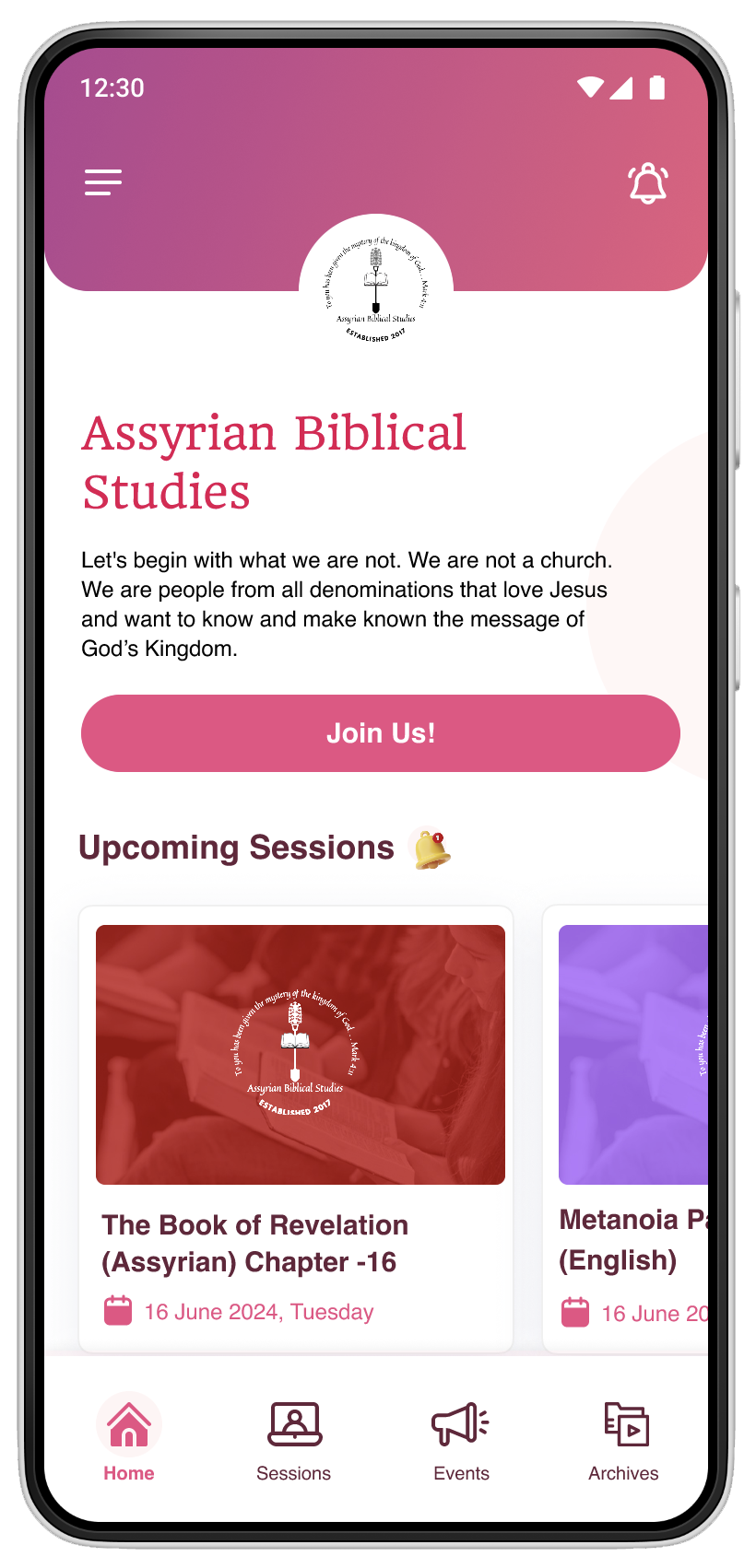
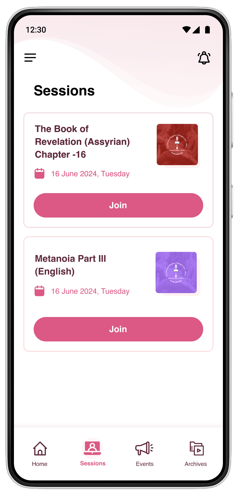
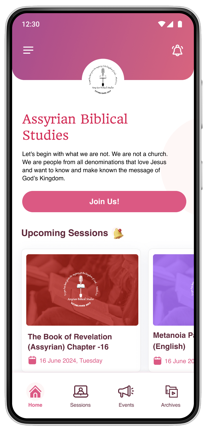
A simple starting point for discovering the community and upcoming content.
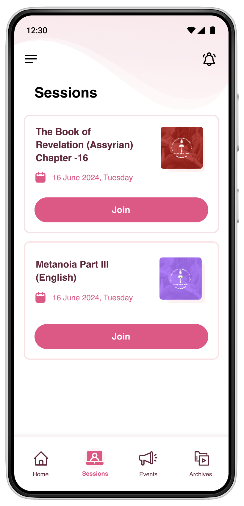
A direct way to discover upcoming Bible study sessions and community events.
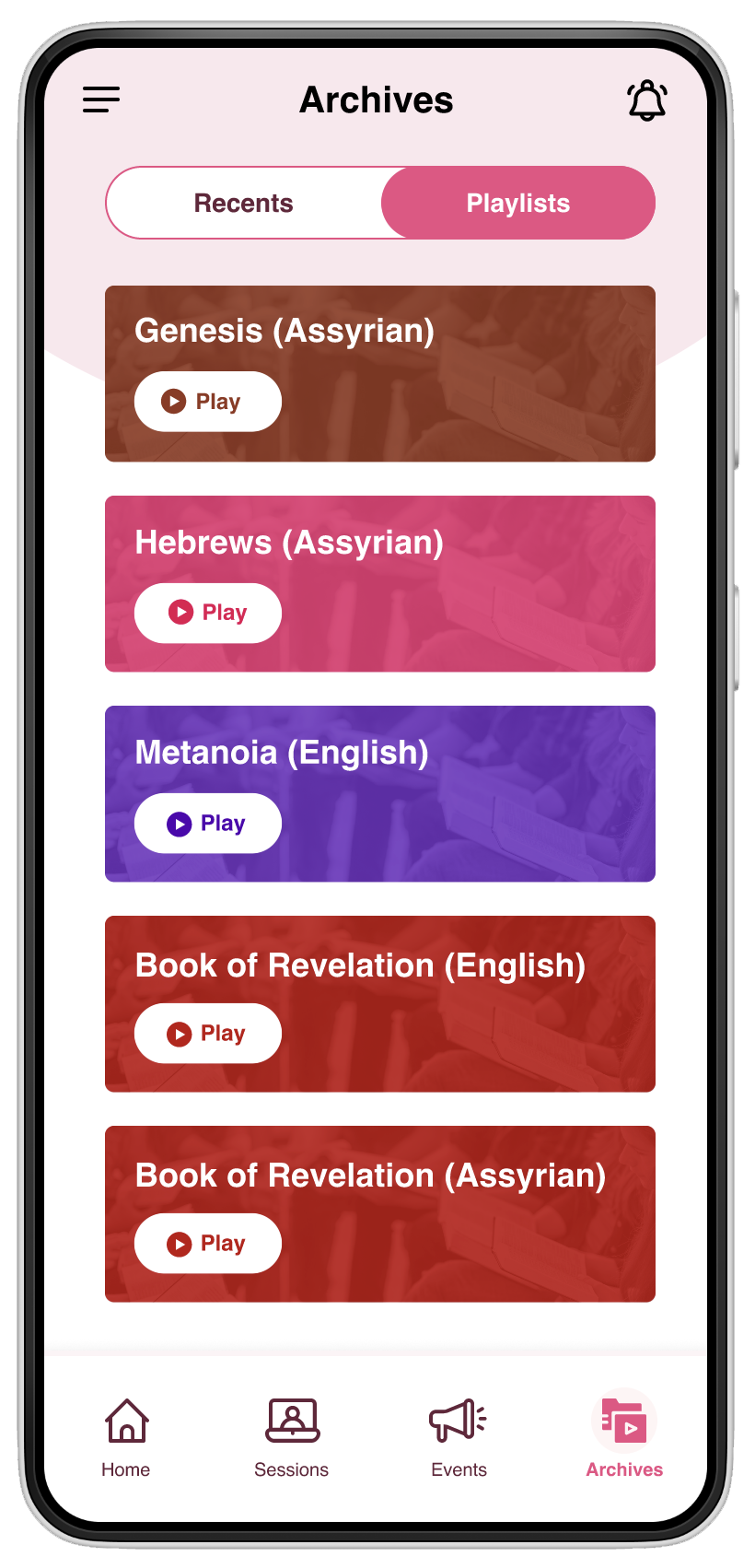
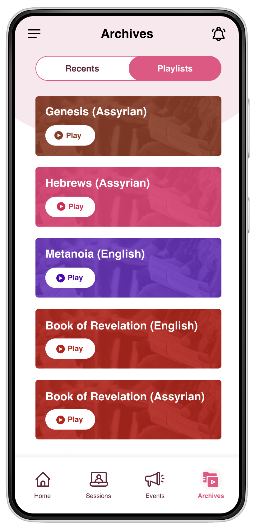
A centralized space for accessing recent videos and playlists.
Home — Start with what matters
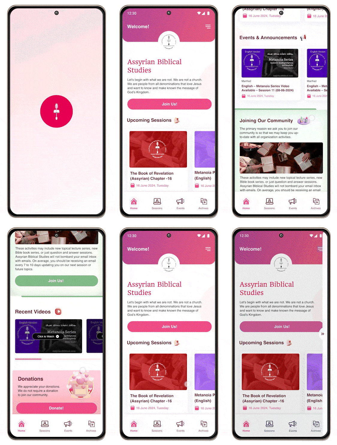
The home experience was designed as a simple entry point into the platform. Rather than overwhelming users with content, the interface prioritizes the organization introduction, primary CTA and upcoming sessions.
- 1Clear welcome message
- 2Primary “Join Us” CTA
- 3Upcoming sessions
- 4Quick navigation
- 5Strong content hierarchy
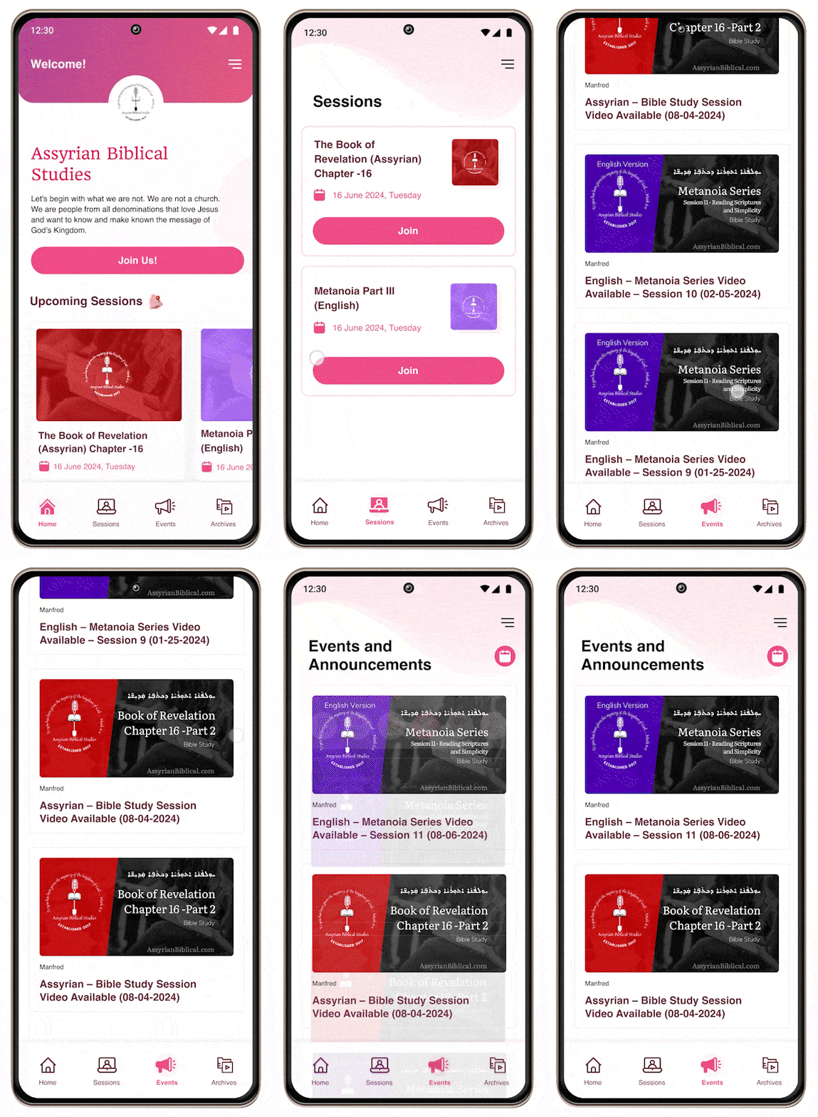
Sessions & Events — Never miss an opportunity to participate
The Sessions experience brings upcoming Bible studies and events into a single discoverable space. Users can quickly understand what is happening, when it is happening and how to participate.
- 01Discover
- 02View session
- 03Understand details
- 04Join
- Event / session cards
- Date visibility
- Clear Join CTA
- Visual differentiation between sessions
- Easy navigation
Archives — Turning content into a library
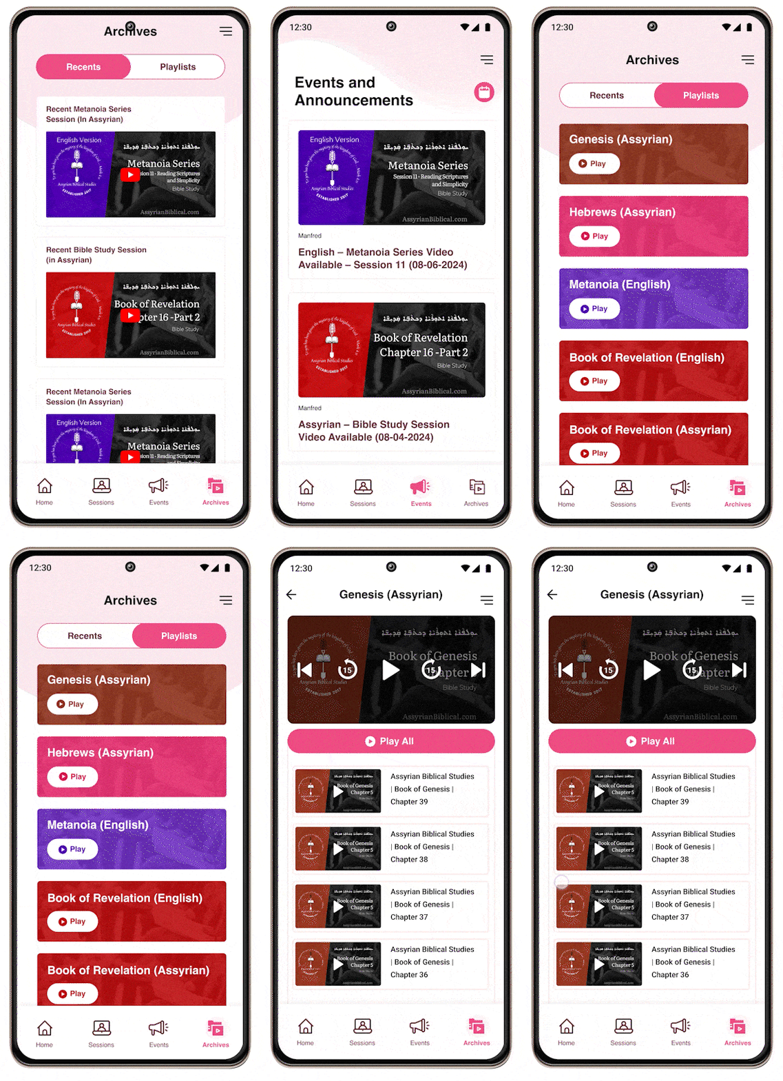
The Archives experience creates a centralized content library for recent videos and playlists. Instead of requiring users to search across external platforms, relevant content becomes accessible directly from the app.
- Recent videos
- Playlists
- Video thumbnails
- Clear categorization
- Familiar video interaction
- Easy content discovery
Small decisions that shaped the experience
Simple navigation
Kept the primary navigation focused on the four most important destinations.
Content-first cards
Used cards to make sessions, events and videos easy to scan.
Clear primary actions
Used prominent actions such as Join Us and Join to reduce ambiguity.
Mobile-first hierarchy
Prioritized information that users need immediately on smaller screens.
One platform. One simple experience.
The final concept brings the core Assyrian Biblical Studies experience into a focused mobile platform — helping users discover, participate and continue learning from one place.
Designed to create a more connected experience
Centralized content
Biblical study videos and playlists are brought into one accessible experience.
Easier discovery
Users can quickly discover upcoming sessions and events.
Simplified navigation
The experience reduces complexity through a focused navigation structure.
Stronger digital engagement
The platform creates a more direct connection between the organization and its community.
Outcome statements are based on the design objectives and solution scope; quantitative performance metrics were not available for this case study.
What I learned
Simplicity is a design strategy
When content is meaningful and information-rich, reducing interface complexity becomes even more important.
Context matters
Designing for a specific cultural and linguistic community requires sensitivity beyond visual aesthetics.
Content discovery is UX
Creating a good content library is not only about storing content — it is about helping users discover the right content at the right moment.
If I continued the product
- Personalized content recommendations
- Search across biblical content
- Push notifications for upcoming sessions
- Bookmarks / saved videos
- Offline video/content access
- Multilingual content experience
- Accessibility improvements
- User engagement analytics
- Community interaction
Designing for meaning, not just usability.
This project reinforced the importance of creating digital experiences that respect the user's context while making meaningful content easier to access.
Vigneshwaran G · 2026